
USA Hemp Website Review
Conditions:
The website lacks user-friendliness, especially on the product pages.
Product descriptions are absent or insufficient and need optimization.
Website speed optimization is required for better performance, and content clarity needs improvement.
Landing Page:
Tagline:
The brand lacks a clear slogan or tagline.
Proposed: “Crafted By Nature, Perfected By USA HEMP.”
Correct the grammatical mistake (“Dot Instead Of Comma”) by using a comma after “Nature.”
Content Adjustments:
Ensure the font size is larger and in one line to effectively convey the brand message.
Correct capitalization: “Farm to Table CBD Products.”
Content Streamlining:
Shorten the content to three lines for improved readability and clarity.
Why USA Hemp?
Align and sequence the lines vertically and horizontally for coherence.
Revise to eliminate unnecessary words without stuffing the content.
Popular Products:
Remove extra spaces between words.
Place dosage details on the “Buy Now” page for clearer customer understanding.
How It Works:
Adjust to “How It Works?” for clarity.
Simplify to “Simple & Elegant” instead of “It’s simple, really.”
Revise instructions for better clarity and flow.
Call-to-Action (CTA):
Update to “Stay Healthy, Stay Wealthy! Discover More!”
Adjust from “Your Health Deserves Better! Discover all of our products” to maintain consistency and clarity.
Subscription Offer:
Change to “Feel Great Every Month. Join Our Community Committed To Staying Healthy. Get 15% Off USA Hemp.”
Adjust from “Feel Your Best Every Month. Join Our Community Of People Committed To Feeling Better And Get 15% Off USA Hemp” for improved clarity and consistency.
Truly Organic:
Use “Truly Organic” instead of “TRUE Organic.”
Revise the remaining content for clearer messaging and coherence.
Natural Ingredients:
Opt for “Natural Ingredients” instead of “Honest Ingredients.”
Ensure clarity in the revised content for better understanding.
Rescue Farm:
Revise and clarify content related to Rescue Farm for better coherence and impact.
Contact Page:
Change “Contact Us. Fill Up The Form Below!” to “Contact Us. Fill Out The Form Below!”
Adjust from “Contact Us. Contact Our Team Using The Form Below.” for simplicity and clarity.
OUR MISSION Page:
Detailed revision is needed for improved clarity and coherence. Ensure the mission statement is clear, concise, and aligns with the brand’s values and goals.
Product Showcase:
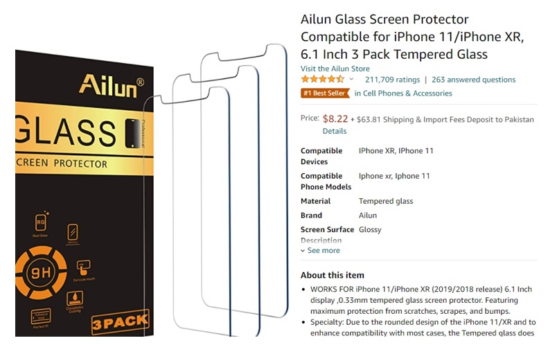
When a buyer visits a product page, their primary focus is on checking the features, key points, and specifications. Buyers typically do not immediately read the detailed description; instead, they first ensure that the product meets their specific needs. Once satisfied with the match, they then turn to the description to understand the benefits.
For instance, take a look at Amazon product pages. They follow a similar pattern where specifications and key points are highlighted prominently at the top, while the detailed description is further down.
Another Example,
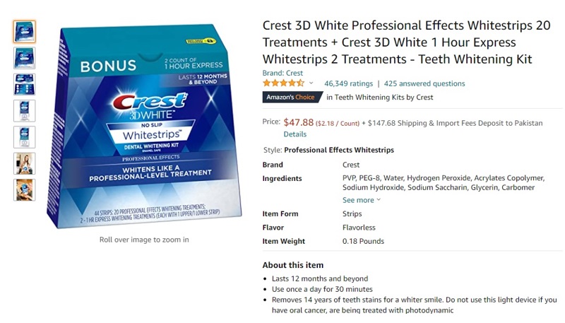
An issue observed with the USA Hemp product page is its less-than-ideal buyer friendliness.
For example, the short description often duplicates content from the long description, which can confuse buyers.
The short description should instead provide a concise, sequential overview of the product’s features, akin to best practices seen elsewhere. Additionally, any symbols indicating effects should also be included in both the short and long descriptions.
Another significant flaw is the large gap between the short and long descriptions on the product page.
This space should ideally be filled with FAQs, ingredient lists, and lab test results, placed after the detailed description. Presenting information in this organized manner ensures clarity for buyers and avoids unnecessary frustration. Moreover, product titles should incorporate focused keywords to enhance visibility and relevance in search results.